2/28/13

Simplicity

Demonstrations from Recent Classes
I am always talking about keeping things simple.  KEEP IT SIMPLE.  Don't try so hard.

Because it is winter (very winter here in northern Michigan) we certainly can't paint outside.  We get a little tired of still lifes, so we paint from sketches and photographs. When we look at a photograph, our brains seem to tell us we have to paint the whole thing  -  the whole scene and all the details.

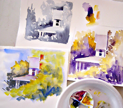
Each of the paintings, above, was done from photographs with a lot more information.   The photo reference for the painting in the top left showed the whole house and the garden next door.  The painting in the top right was taken from a photo that showed a lot of dark cast shadows from the trees and and a cottage on the left side.  The bottom painting was done from a photo of a whole house and the door was very plain.

What we talk about when we're looking at our reference photos is what is it that attracts us, and how simply can we state that.  These are very small paintings  -  about 8" X 5".

A big painting project is always fun and challenging. but keeping the brush moving with some small, quick paintings is very rewarding too.  Dig out some photographs and see what you can crop and simplify.


2/12/13

Another Triad

A Demonstration Using a Different Triad
The watercolor sketch on the left was done for Wednesday's class using the colors mentioned in the previous post and listed in the picture, by the palette. The sketch on the right was done for Thursday's class using Phthalo blue, Quinacridone burnt scarlet, and Quinacridone gold.

These are just sketches of a portion of what might turn into a "serious" painting.  In the sketch on the left, I like the way the foliage breaks up the shape and color of the red brick chimney.

Painting with a triad is fun  -  it makes us think about color mixing and sets a mood for the painting.  A triad is just three colors which are a variation of the primaries  -  red, yellow, and blue.  A triad can also be done using the secondary colors, purple, green, and orange, but I think the mix is muddy and dark.

Try some variations of triads  -  see what you come up with.


2/6/13

Working with a Triad

Today's Demonstration  -  lower left painting
Keeping in mind that this was just a trial run, I sketched and painted this very quickly, using a large brush.  I learned from the first two sketches what I did and didn't want to do as far as lights and darks and balance.

I knew I needed to get rid of the bright white porch pillars.  In the two-color painting (on the right) I scrubbed around a bit to dull down the white, but knew the three identical shapes just didn't work, dulled or not.

For the full color sketch, lower left, I used only three colors  -  you can see them in the little mixing saucer.  The colors are ultramarine blue, quinacridone red, and hansa yellow. If I'm painting with a triad, I like to keep them separate from  my regular palette, because, without thinking, I will just start grabbing for other colors.

The colors in the painting got a little muddy, and I'm not pleased yet with the foliage at the top.  I have to do the same demonstration again tomorrow, so I'll see what I can do to fix those problems.

By the way  -  isn't that little saucer the cutest thing you've ever seen in your life?!  A friend bought some in England.  We all fell in love with them, so she called the store and had them ship some to us.  I think they are called china tinting saucers.  I really don't know what they are used for, but I thought they were perfect for triads.  The fourth space is good for keeping a neutral mix going.

2/5/13

Working Out Values

Demonstrations in Class
Last week we worked on very simple, small paintings to work out the lights and darks (values) and then balance with warms and cools, using complementary colors. We didn't all get to a three-color painting.

Figuring out the lights and darks is a very important part of planning a painting, but I also think a little color study goes a long way toward the success of a painting.  Color can really change the direction of the sketch you had done in black and white.

I can see from these two little studies that I would need to really tone down the bright white of the porch pillars.  The spacing, shape, and bright white value of them, make them the focal point.  I had intended for the window to be the focal point.  I'm going to work out the three color study of this for this week's class.

 Blogger doesn't seem to want to save this post.  Is it something I said?